1. Why the style word matters more than the product photo
In Japan a product is usually described by what it is: A5 notebook, 80gsm paper, thread-bound. In the United States a product is described by who it is for and what world it belongs to. An American shopper who calls herself "a cottagecore person" is telling you her whole buying identity in one word, and she will scroll past a beautiful notebook that is not labelled in her language.
This is not marketing fluff. Etsy search, Pinterest boards, Instagram hashtags and subscription-box briefs all run on these style words. A single accurate word in your title and tags puts your work in front of a group of people who are already looking for exactly what you make.
The difficulty for Japanese makers is that these words are cultural, not literal. "Rustic" does not mean old. "Coquette" is not about romance. The images below are the fastest way to see what each word really means — find the one that looks like your work, and use that word.
2. Cottagecore
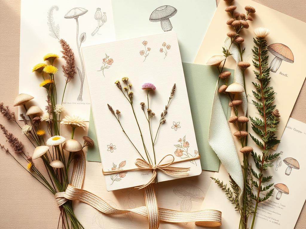
A romantic countryside fantasy: baking bread, pressing flowers, letters written by a window. Soft, faded, hand-made, slightly imperfect. This is the single largest style for paper goods in the U.S. and the most natural fit for many Japanese makers already working with botanical illustration and washi-like texture.
The mistake to avoid is making it too clean. Cottagecore wants a little wear — deckled edges, uneven ink, muted rather than bright colour. A crisp, perfectly registered print reads as "modern floral," which is a different and much more crowded market.
- Colours
- Sage, cream, dusty rose, butter yellow, soft brown
- Motifs
- Wildflowers, mushrooms, ferns, bees, gingham, hand lettering
- Who buys it
- Women 25–45, journalers, gardeners, wedding planners
- Listing words
- cottagecore, floral, botanical, whimsical, vintage-inspired
3. Coquette
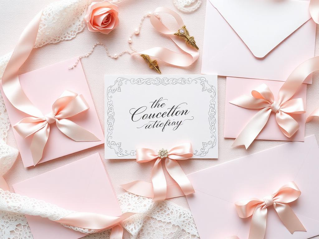
Bows, lace, pearls, pink. Coquette is the current dominant style among American shoppers aged roughly 16–30, and it is the closest thing the U.S. has to its own version of 乙女系. It is deliberately hyper-feminine and slightly theatrical — a ribbon on everything, script lettering, blush on blush.
If you already make lace paper, ribbon-tied sets or pale pink sticker sheets, you are making coquette products and probably not saying so. Adding the word alone often changes traffic more than any photo change.
- Colours
- Blush pink, cream, white, soft red accents
- Motifs
- Bows, lace, pearls, cherries, hearts, script type
- Who buys it
- Teens and women 16–30, heavy TikTok and Pinterest users
- Listing words
- coquette, bow, ribbon, balletcore, soft girl, feminine
4. Dark academia
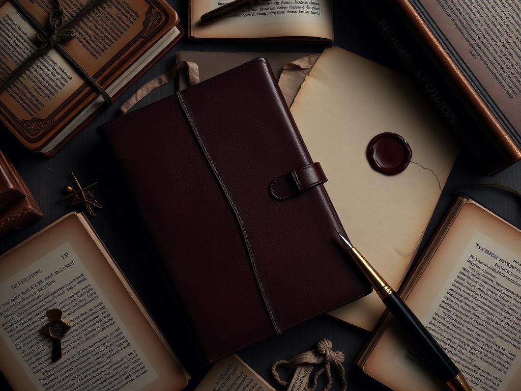
Old universities, libraries, letters sealed with wax. Deep browns, oxblood, ink black, aged paper. This is the style that sells fountain pens, leather covers, wax seals and cream-toned refills — categories where Japanese quality is already respected.
Dark academia buyers are unusually willing to spend on tools rather than decoration, and they read product descriptions carefully. Precise specifications (gsm, bleed resistance, binding) sell here in a way they do not in most American niches.
- Colours
- Oxblood, charcoal, walnut brown, aged cream, brass
- Motifs
- Wax seals, serif type, Latin, moths, architecture, quills
- Who buys it
- Students and readers 18–35, fountain pen community
- Listing words
- dark academia, vintage, gothic, literary, antique-style
5. Minimalist / Scandi
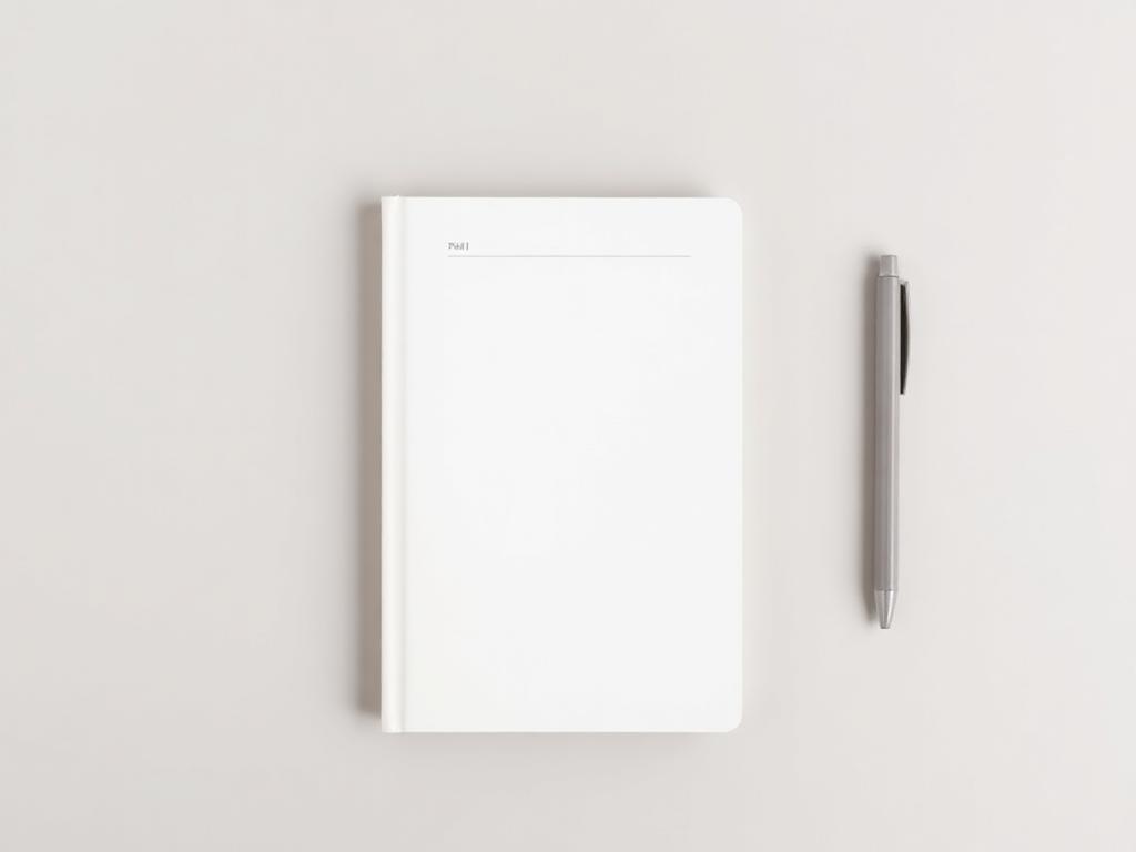
Almost nothing on the page. One weight of type, one neutral colour, generous empty space. Americans call this minimalist, Scandi, or "clean girl" when it is aimed at a younger audience. Japanese makers often already work this way and undervalue it because it feels ordinary at home.
The important nuance: American minimalist is warmer and slightly softer than Japanese minimalism — off-white rather than pure white, rounded rather than sharp. Pure grey-on-white can read as corporate and cold to a U.S. buyer.
- Colours
- Off-white, greige, oat, soft black
- Motifs
- Thin grids, single lines, sans-serif, no illustration
- Who buys it
- Professionals 25–45, productivity and planner buyers
- Listing words
- minimalist, clean, simple, Scandinavian, neutral, aesthetic
6. Boho
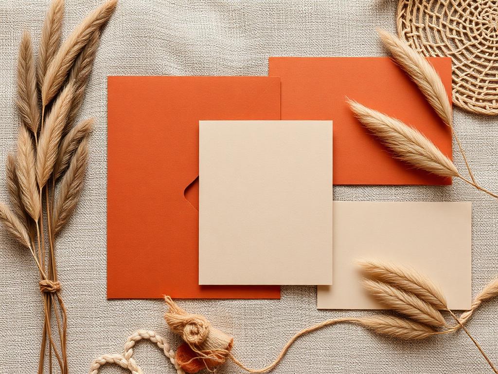
Warm desert colours, natural texture, hand-drawn arches and abstract shapes. Boho is relaxed and earthy rather than floral, and it dominates the American wedding and home-decor market — which means invitation suites, table cards and art prints.
Boho and cottagecore are frequently confused. Cottagecore is a green English garden; boho is a dry Californian desert. If your palette is terracotta and sand rather than sage and rose, you are boho.
- Colours
- Terracotta, rust, sand, olive, warm cream
- Motifs
- Arches, pampas, abstract line art, macrame, sun shapes
- Who buys it
- Brides, event planners, women 25–40
- Listing words
- boho, bohemian, earthy, terracotta, neutral, desert
7. Modern farmhouse / rustic
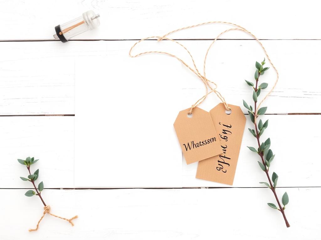
White painted wood, kraft paper, twine, simple black type. "Rustic" in the American sense does not mean rough or antique — it means clean country: tidy, practical and unfussy. It is enormous in the U.S. suburbs and drives gift tags, labels, recipe cards and seasonal signage.
This is the easiest style to produce and the hardest to differentiate, so quality of paper and printing is what wins the sale. It is also the most seasonal — plan around Thanksgiving and Christmas.
- Colours
- White, kraft brown, black, sage green
- Motifs
- Twine, eucalyptus, script + block type mix, mason jars
- Who buys it
- Women 30–55, suburban gift and holiday buyers
- Listing words
- farmhouse, rustic, kraft, country, homestead
8. Y2K
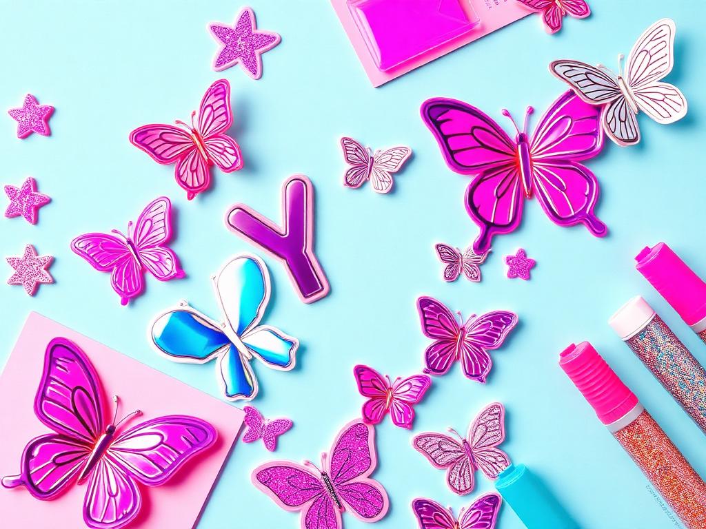
The year 2000 revived: holographic foil, chrome, hot pink and cyan, butterflies, glitter. Loud, plastic and joyful. Sticker sheets, holo tape and shiny die-cuts sell fast in this category, especially to buyers under 25.
Margins here rely on volume and low unit cost, not craft. If you print holographic or foiled stickers, this word belongs in your listings — it is one of the highest-traffic style tags on Etsy.
- Colours
- Hot pink, cyan, lilac, chrome silver, lime
- Motifs
- Butterflies, stars, bubble type, holo foil, flip phones
- Who buys it
- Teens and young adults 14–25
- Listing words
- y2k, holographic, 2000s, retro, iridescent, trendy
9. Retro / groovy 70s
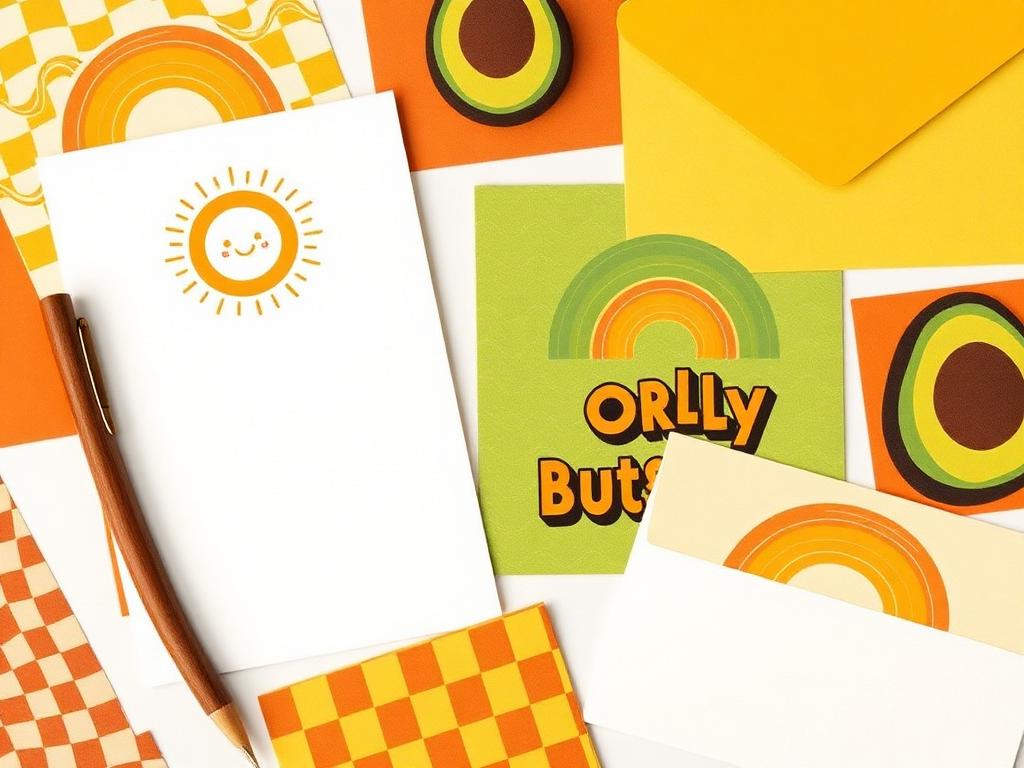
Mustard, burnt orange, avocado green and brown, with wavy checkerboard, smiling suns and thick bubbly lettering. Americans call it groovy or retro, and it is closely tied to the same nostalgia that makes 昭和レトロ popular in Japan — but the palette is warmer and the shapes are rounder.
This style crosses easily into apparel and homeware collaborations, so it is worth photographing your work in context if you go this direction.
- Colours
- Mustard, burnt orange, avocado, chocolate brown, cream
- Motifs
- Rainbow arcs, wavy checks, smiley suns, bubble type
- Who buys it
- Women 20–35, indie shops, music and coffee culture
- Listing words
- retro, groovy, 70s, vintage-inspired, funky
10. Grandmillennial
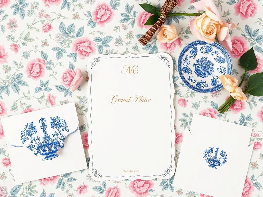
Sometimes called granny chic: chintz florals, blue-and-white china, scalloped edges, monograms, gingham trim. It is a young person deliberately using her grandmother's taste, and it is the heart of the American personal-stationery and thank-you-note market.
This buyer values correctness — proper card sizes, matching envelopes, monogram placement. Getting the format right matters as much as the design, which is why the U.S. size conventions are worth checking before you print.
- Colours
- China blue, white, pink, green, gold accents
- Motifs
- Chintz, toile, scallops, monograms, gingham, ginger jars
- Who buys it
- Women 25–50, U.S. South and East Coast, gift market
- Listing words
- grandmillennial, chinoiserie, preppy, monogram, scalloped, toile
11. Whimsigoth
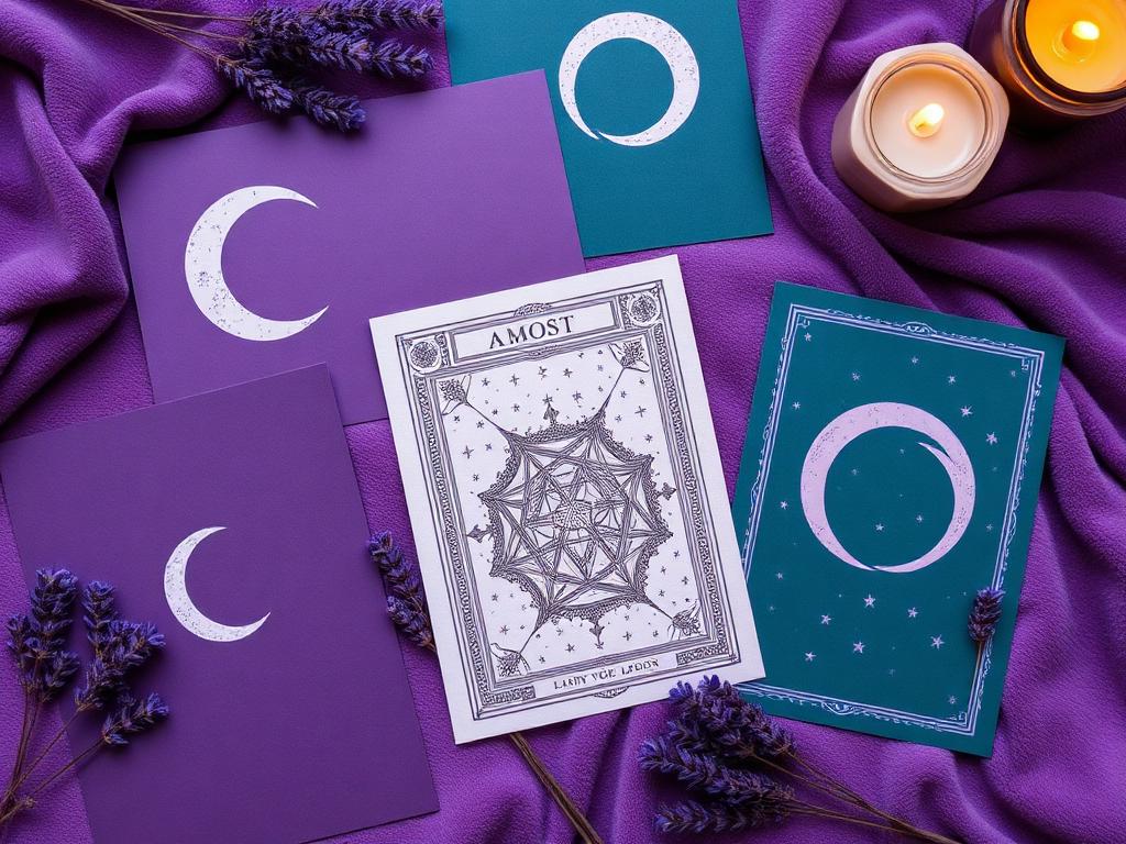
Moons, stars, tarot, deep purple and teal, velvet and candlelight — 1990s mystical rather than modern gothic. Whimsigoth is softer and more romantic than dark academia and sells strongly in journals, oracle-style card decks and celestial sticker sets.
It is also one of the least crowded categories for imported paper goods, which makes it a good position for a maker who wants distinctiveness rather than volume.
- Colours
- Deep purple, teal, plum, silver, midnight blue
- Motifs
- Moon phases, stars, tarot, herbs, crystals, ornate frames
- Who buys it
- Women 20–40, journaling and spiritual-practice buyers
- Listing words
- whimsigoth, celestial, mystical, witchy, moon phase, tarot
12. Mid-century modern
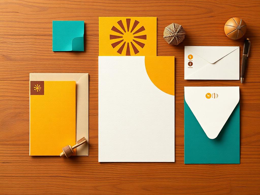
1950s–60s American design: teal, mustard and walnut, atomic starbursts, clean geometry. This is a design-literate audience that buys art prints, greeting cards and desk objects and notices printing quality immediately.
Mid-century sits close to some Japanese design of the same era, so it can be a comfortable and credible position for makers with a graphic rather than illustrative style.
- Colours
- Teal, mustard, walnut brown, cream, burnt red
- Motifs
- Starbursts, boomerangs, flat geometric shapes, retro sans type
- Who buys it
- Design-aware adults 30–60, gallery and museum shops
- Listing words
- mid century modern, MCM, atomic, retro geometric, danish
13. Coastal grandmother
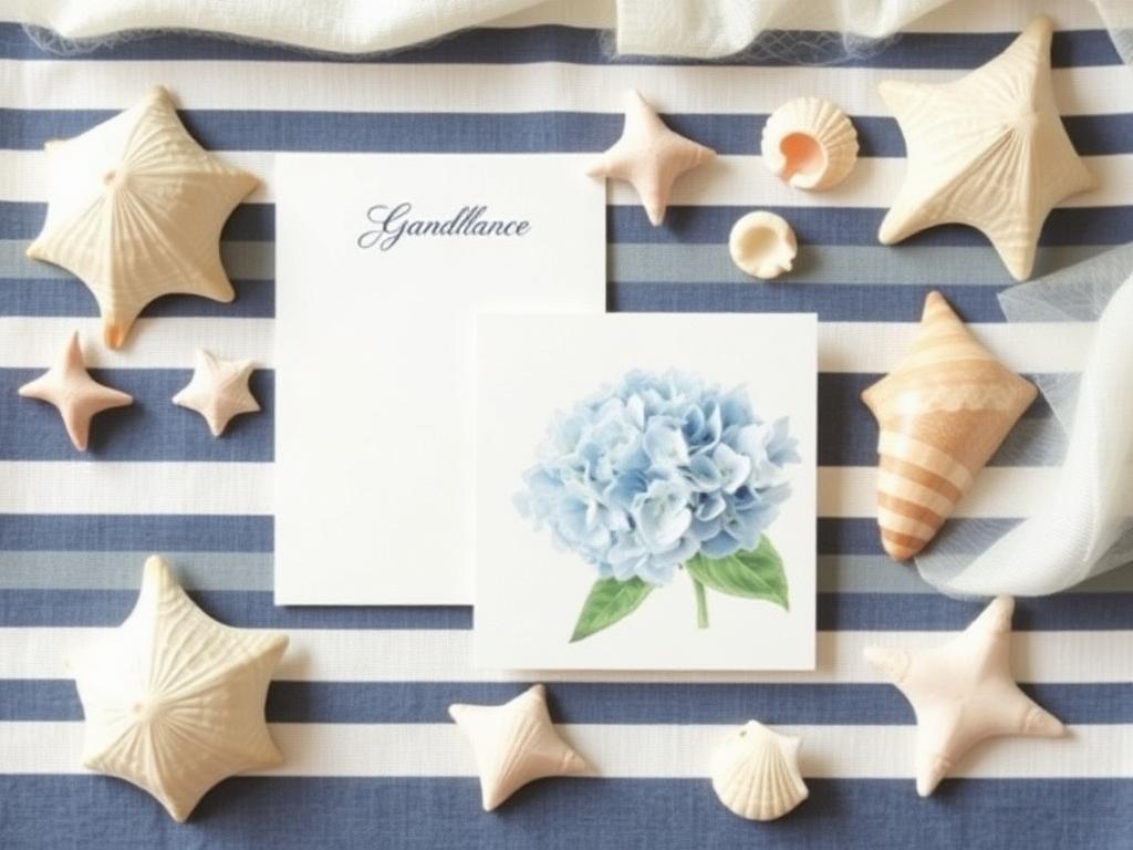
Navy and white stripes, hydrangeas, linen and shells — relaxed New England seaside elegance rather than tropical beach. It is a calm, wealthy-feeling style that performs from spring through summer and dominates the U.S. summer-wedding season.
Do not confuse it with tropical or 'beachy' designs with palm trees and bright turquoise; those read as souvenir goods to this buyer.
- Colours
- Navy, white, sky blue, sand, soft green
- Motifs
- Stripes, hydrangeas, shells, rope, watercolour washes
- Who buys it
- Women 35–65, summer weddings, East Coast gift market
- Listing words
- coastal, nautical, hamptons, seaside, watercolour, preppy
14. Where kawaii actually sits
Americans know the word kawaii, but they use it narrowly: round characters, pastel colours, faces on objects. If your work is delicate and elegant rather than character-based, tagging it kawaii puts you next to Sanrio-style goods and mass-produced imports, and the comparison hurts your price.
A useful rule: kawaii is a character word in the U.S., not a taste word. If there is no face, choose a style word from the list above instead, and let "Japanese" do the work that kawaii cannot — 'Japanese paper', 'made in Japan', 'Japanese stationery' are all strong, high-trust search terms on their own.
You can of course combine: 'kawaii cottagecore mushroom stickers' is a perfectly normal American listing title and reaches two audiences at once.
15. How to find your own style word
Step one: lay out five of your best-selling products and look only at colour. Warm and earthy? Boho. Muted green and pink? Cottagecore. Pale pink with ribbon? Coquette. Brown and black? Dark academia. Colour identifies the style faster than motif does.
Step two: search that word on Etsy and Pinterest and look at the first twenty results. If your work would sit naturally in that grid, the word is right. If it looks like a stranger in the group, try the next closest word.
Step three: use one primary style word and at most two secondary ones. Listing five style words dilutes the signal and Etsy treats it as noise. Put the primary word in the title, the others in tags.
Step four: keep the word consistent everywhere — title, tags, Instagram bio, wholesale line sheet. American buyers, box curators and shop owners all use the same vocabulary, and consistency is what makes you findable and easy to recommend.
Visibility Studio
Turn the style word into search traffic
Knowing your style is step one; getting it into titles, tags, alt text and pins is step two. Visibility Studio teaches the English keyword structure American platforms actually reward, with templates you can fill in for each product.
See Visibility StudioWholesale Studio
American shops buy by style, too
Store buyers and subscription boxes brief by aesthetic — 'we need cottagecore for spring.' Wholesale Studio covers line sheets, minimums and the U.S. buying calendar so your style lands in front of the right shop at the right month.
See Wholesale StudioThe Studio
Not sure which word is yours? Ask.
Members can post photos of their products and get a direct answer on which American style words fit, plus English wording help and translation support for listings and pitches. You do not have to guess alone.
See The StudioFAQ
Can my products belong to more than one style?
Yes, and most do. Use one primary word in the title and one or two related words in tags. What does not work is listing five unrelated styles — it makes your shop look undirected to both the algorithm and the buyer.
Is cottagecore still popular, or is it over?
It is past its 2020–2021 peak but remains one of the largest steady categories for paper goods in the U.S. Trend styles like Y2K and coquette rise and fall much faster; cottagecore, boho, farmhouse and minimalist behave more like permanent categories.
Should I redesign my products to fit an American style?
No. Start by naming what you already make accurately — most Japanese makers already sit inside one of these styles without knowing the word. Redesigning to chase a trend usually weakens the thing that made your work worth buying.
Where exactly do I put the style word?
First in the Etsy or Shopify title, in your tags, in the image alt text, in the first line of the description, and in your Instagram bio. Consistency across all of them is what makes the word do its job.
Does 'kawaii' hurt my listing?
Only when your product has no characters. For character goods it is a strong, high-volume search term. For elegant or minimal paper goods it attracts the wrong shopper and pulls your price down.
How do I know which style sells best in my category?
Search each candidate word on Etsy, sort by 'most recent', and see how many listings are being added — high volume means demand but also competition. Then check Pinterest for whether the style is rising or fading. Visibility Studio walks through this research step by step.